one client
a self-serve booking flow
that eliminates back-and-forth messaging
- .year
- 2024 — 2025
- .role
- founding product designer
- .tools
- figma, figJam, notion, claude

problem
Freelance beauty professionals manage every booking through manual messaging. They spend hours daily answering identical questions, manually checking their schedule, and confirming appointments. This creates a compounding problem. Existing tools are built for salons, not solo professionals, adding complexity instead of removing it.
scope
- research,
- product positioning
- UX design,
- visual design,
- design QA
solution
Designed a self-serve client flow paired with a mobile-first professional dashboard — replacing fragmented chat-based coordination with a structured, service-led booking experience.
impact
Project is in active development — quantitative results will follow after launch.
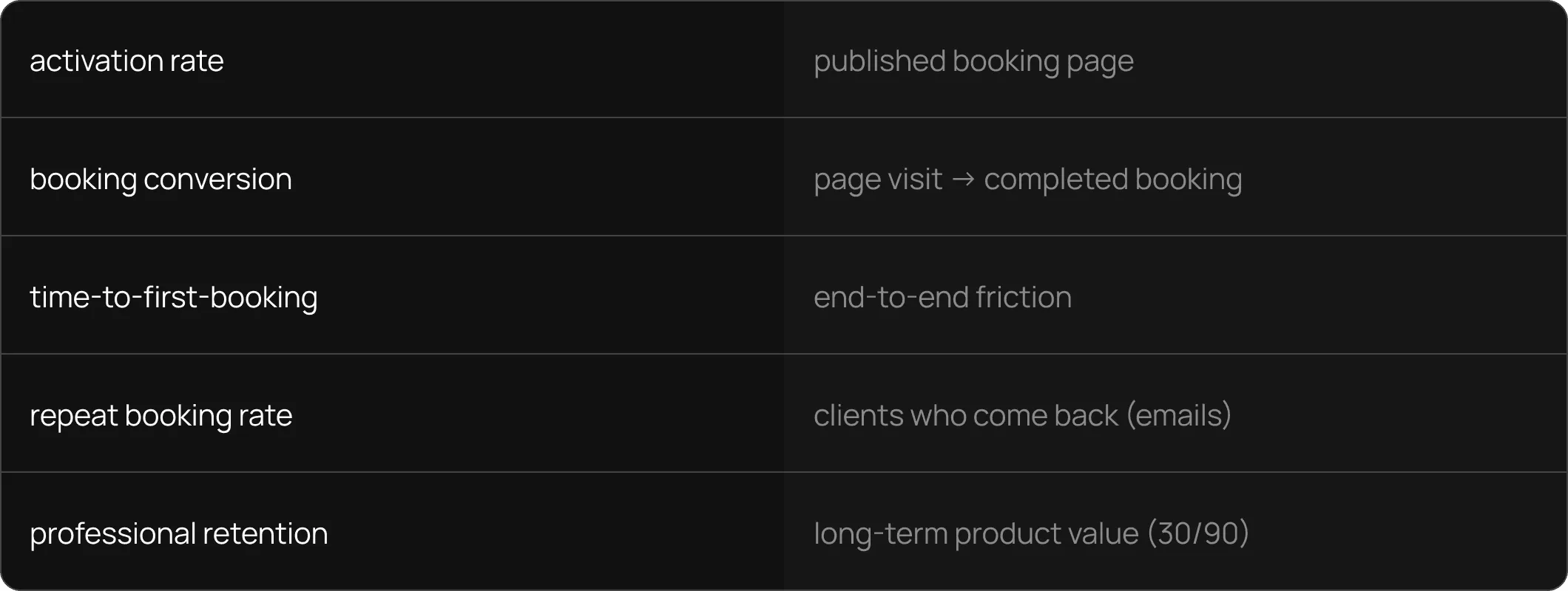
Success will be measured across the full funnel:
- activation rate (professionals who publish a booking page),
- booking conversion (page visits → completed bookings),
- time-to-first-booking, repeat booking rate, and self-reported reduction in manual client communication.
- retention at 30 and 90 days will validate long-term product value.
context
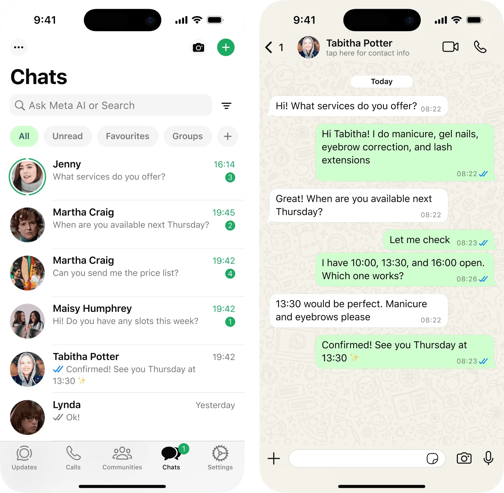
Independent beauty professionals run businesses from their phones. They acquire clients through Instagram, WhatsApp, Telegram, and Google Maps. But every booking still happens through manual messaging.
Professionals spend hours daily answering identical questions, manually checking their schedule, and confirming appointments — all while trying to do their actual work.
- messages per booking
- 4 – 8
- clients per day
- 5 – 15
- daily on scheduling
- ~2 hrs

competitors
existing tools are built for salons, not solo professionals
Every major competitor optimizes for multi-staff operations. For a freelancer who just needs clients to book without a conversation, these tools add complexity instead of removing it.

Key insight
Competitors solve "how do I manage a salon?"
One Client solves "how do I stop answering the same booking questions every day?"
goals
eliminate repetitive messaging
Clients should be able to book without a single message to the professional. Measured by self-reported reduction in manual communication.
minimize time to first booking
A freelancer sets up their page and receives the first real booking as fast as possible. Measured by activation rate and time-to-first-booking.
maximize booking conversion
Every visitor who lands on the booking page should have a clear, frictionless path to confirming an appointment. Measured by visit-to-booking conversion rate.
build a habit, not a one-time tool
The product should become the default way clients book and professionals manage their schedule. Measured by repeat booking rate and 30/90-day retention.
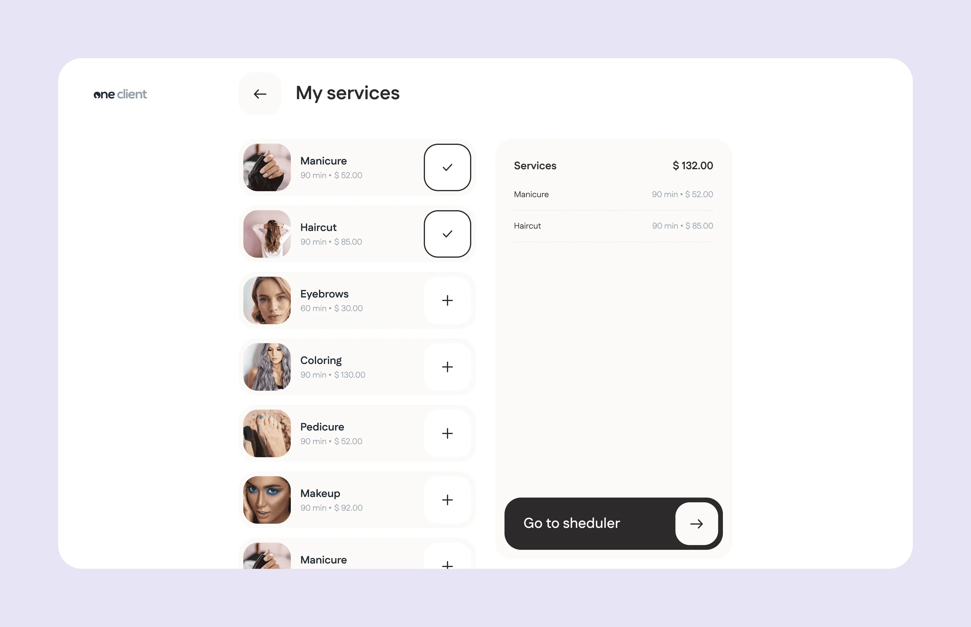
client booking
services and details
A clean list of services with prices visible upfront. Tapping a service reveals a detail view: description, duration, price, and a photo gallery. Clients can navigate between services without going back to the list, reducing drop-off from unnecessary navigation.

sheduler and confirmation
Only available slots are shown. The system handles availability so neither side has to. A summary screen with all details, followed by a confirmation and optional calendar integration. The client walks away knowing exactly when, where, and what they booked.

Calendar integration
Client can save the appointment to their phone calendar with one tap. Since the product is web-only with no push notifications in MVP, this is a lightweight way to reduce no-shows by letting client handle the reminder.
professionals dashboard
calendar
The primary screen. Appointments booked by clients appear automatically. But professionals can also add bookings manually for clients who still prefer to write in chat. Either way, all appointments live in one place, keeping availability accurate and preventing double bookings.

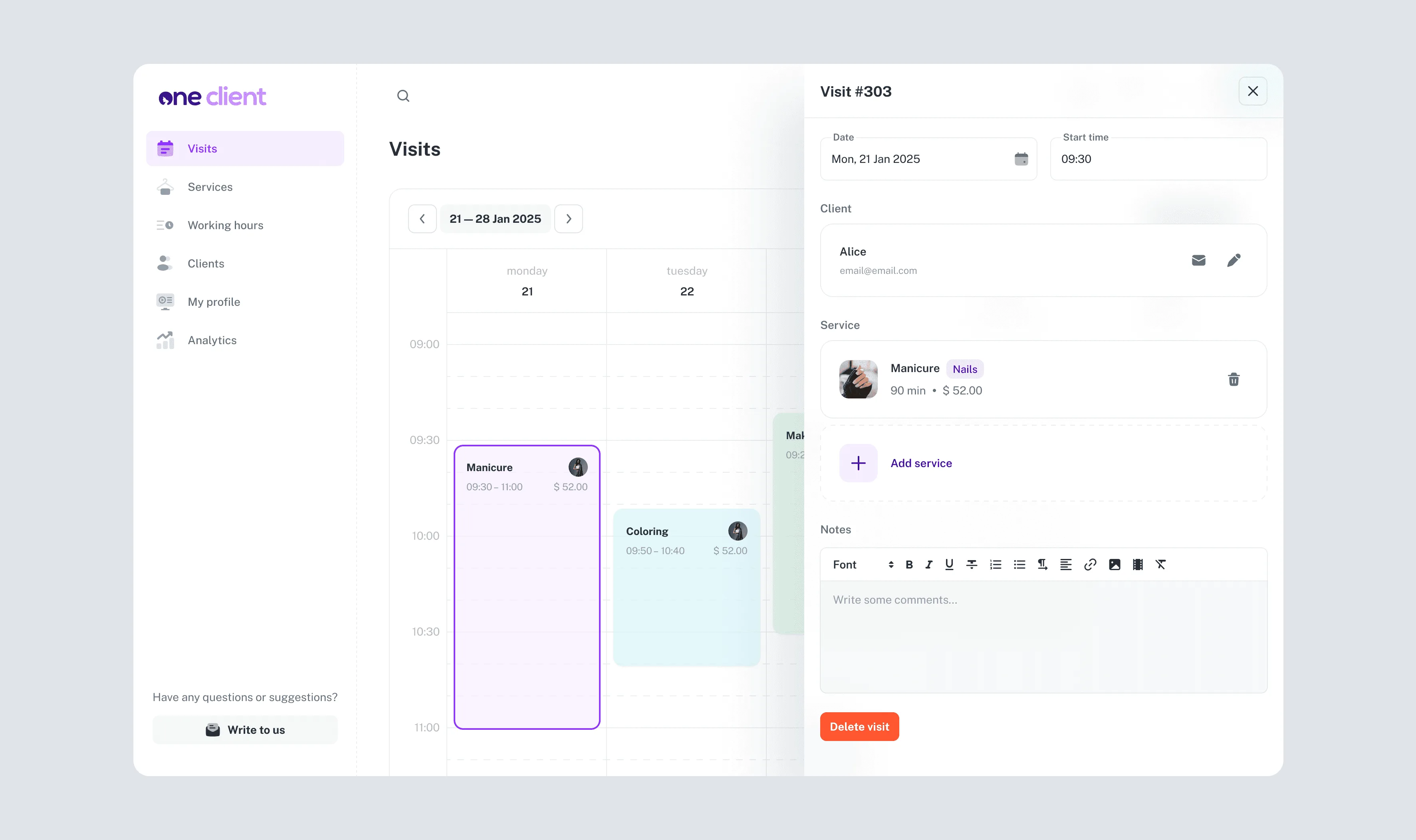
services
Create, edit, and organize services with pricing, duration, descriptions, and photos. What professionals configure here is exactly what clients see on the booking page.

clients
A lightweight CRM. Client records are auto-created from bookings. Professionals can also add clients manually for existing regulars who haven't booked through the platform yet.

profile & settings
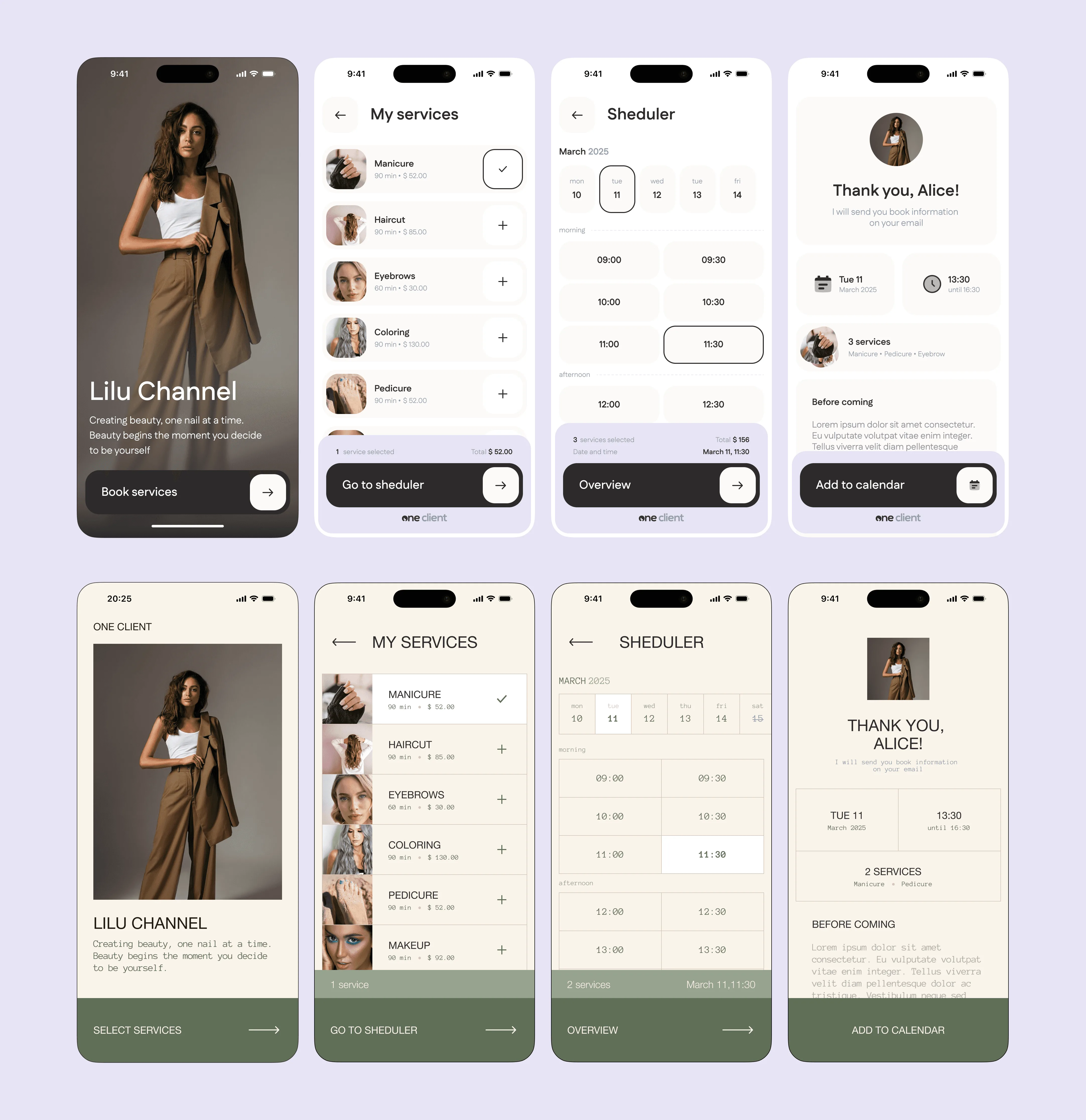
Professional bio, profile photo, location, and a theme selector that controls the look of the client-facing booking page. This is also where the shareable booking link lives — one tap to copy and paste into any bio or message.

Professionals choose a visual theme that sets the tone for how clients experience their booking page. Each theme transforms the client-facing UI — typography, color palette, layout, and overall feel — while the booking flow stays the same.
This isn't full brand customization — it's a curated set of visual styles that match different aesthetics. A minimalist look for one professional, an editorial feel for another. The goal is to let freelancers pick a vibe that feels right, without the complexity of building a custom brand from scratch.
The professional sees a live preview of all three booking screens before committing, and can switch themes at any point. For MVP, the product launches with two themes — enough to validate the concept and understand which visual directions resonate most. The library will grow over time based on what professionals actually want.
key trade-offs
simplicity vs. feature depth
Competitors offer inventory, payments, team management, analytics. We cut all of it from v1. For solo freelancers, every extra feature is cognitive load, not value. Fast and clear first — depth comes later.
ui kit vs. custom design system
The professional dashboard uses an existing component library. A custom system would mean hiring specialists and weeks of work before a single feature ships. The project is self-funded — so we focused design effort on the client-facing booking flow, where first impressions and conversion actually happen.
tight coupling vs. modularity
Client bookings go straight into the calendar — no sync, no separate data store. Less flexible, but zero conflicts and zero manual work. The architecture can absorb staff accounts and multi-calendar later without changing the mental model.
few themes vs. full customization
Full brand control (colors, fonts, logos) multiplies complexity on both sides. Two curated themes are enough to validate whether professionals care about visual identity — and which directions resonate. The library grows from real data, not assumptions.
web-only vs. native app
A native app means push notifications and faster repeat bookings. But requiring a download kills conversion for freelancers whose clients book once or twice. The product is a fully responsive web app — built by a two-person team (designer + backend dev) with a frontend specialist for the dashboard foundation and Claude Code for the rest. Future plan: wrap into a native shell via Capacitor or PWA-to-app tools.
scalability
The product is designed to grow without requiring users to relearn it. Each layer extends the system, none of them replace it.

Team support is a potential expansion path via a separate subscription tier — but the core product stays focused on solo professionals.
monetization
The core product is free — service catalog, client base, booking calendar, and client-facing booking flow with starter themes. Everything a solo freelancer needs to replace chat-based scheduling, at no cost.
Paid subscription unlocks features that help professionals grow: analytics, inventory management, extended theme library, and the ability to auto-block services when supplies run low. Team support with staff accounts is a potential premium tier for later.
Free plan removes the adoption barrier and proves value first.
Professionals upgrade when they've already built their workflow around the product — not before.
success metrics
Success will be measured across the full funnel
current status
The product is in active development. Quantitative outcomes will be added post-launch.
What exists today: a complete, production-ready design system covering the full client booking flow, professional dashboard, onboarding, and all supporting states (empty, error, edge cases). The competitive positioning, monetization model, and success framework are defined and ready for validation.
reflection
This project sharpened my thinking about a specific tension in product design:
the pressure to add features versus the discipline to protect simplicity.
Every competitor I analyzed had solved the same core problem — and then buried it under layers of functionality that made the product harder for the simplest user. The opportunity wasn't to build more, it was to build less, and build it right.
As a founding designer, the most important skill wasn't visual execution — it was deciding what not to design, and defending those decisions with a clear rationale.